In the last month we worked hard in developing our identity and the logo is definitely part of it.
Since we believe that the logo must represent us, we took our time to make it, and express exactly what we are.
We followed few guidelines:
- It must give a recognizable face to Wine n’ About
- It must not summarize everything we are
- The logo is a suggestion, a clue of what we are
- It must be abstract and not literal
- The logo must work by itself, without adding our name
We didn’t want to use the common wine-related images – read grape, bottle, wine glass – and create something new, giving a pleasant, clean, modern and bold sense of harmony.
Is it abstract, modern, minimal and clean enough? We know, you can’t immediately relate it to wine, and that’s why we decided to explain it to you!
Our logo has three starting points:
- Wine n’ About Signature Wine Categories
- Our initials – Wine n‘ About
- The swirling movement of wine in the glass
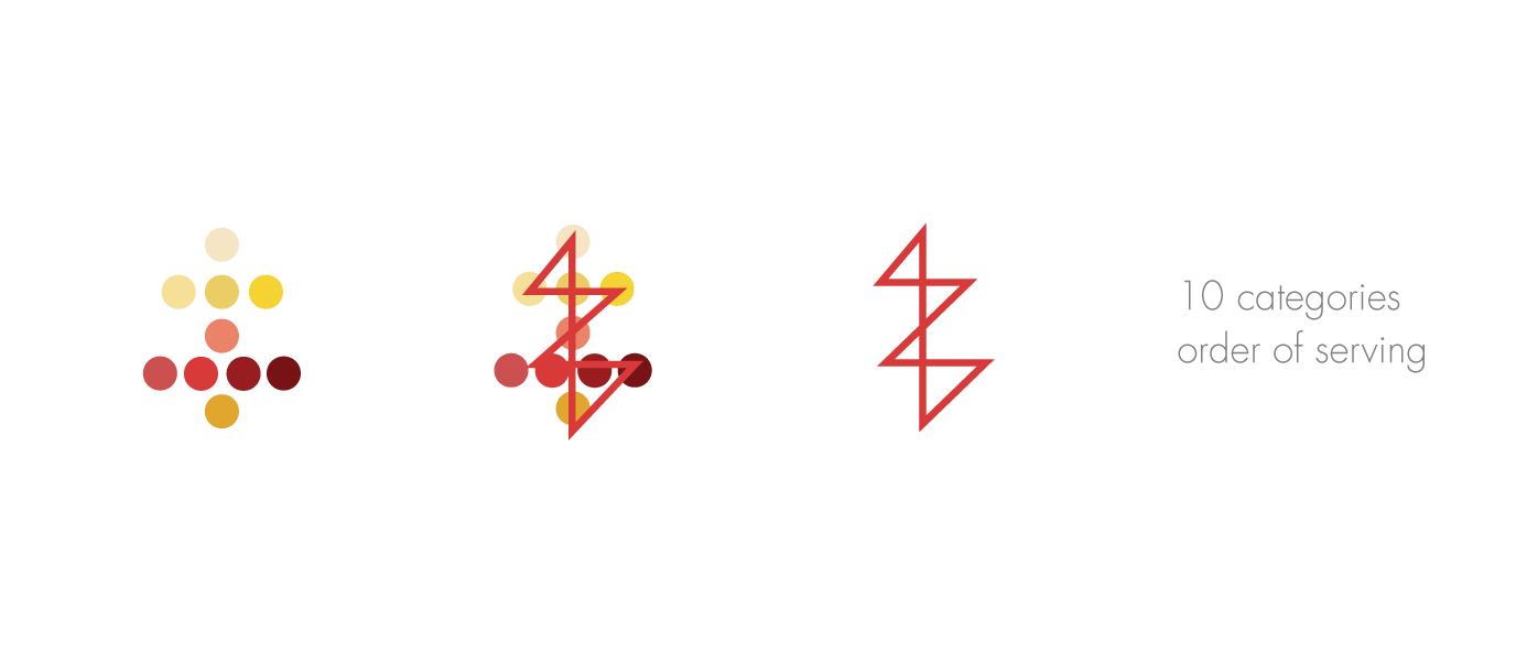
We divide wine in 10 main categories:
- Bubbles – including Champenoise and Charmat
- White – Including Aromatic, Crisp, Rich
- Rosé
- Red – Light n’ Fruity, Rich n’ Fruity, Earth n’ Spices, Big n’ Bold
- Sweet
To learn more about our categories, check the infographic!
Using the category color graphic, we came up with this minimal design:
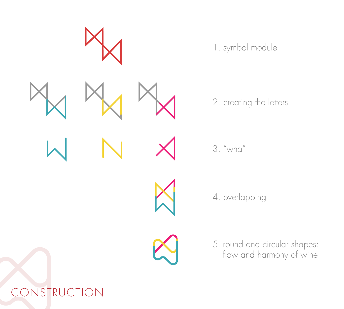
Then we used our main letters – W N A – and added a swirling effect. This is the construction process of our logo.

And voilà! Here it is Wine n’ About logo. We will start using it together with our name, to make you feel comfortable with it.
Now you know, when you see it around, Wine n’ About is nearby!
 Tell us what you think of our logo and send us your feedback on anything else, to improve ourselves!


 0
0